2000
with Sarah Winter and Jörg Batschi
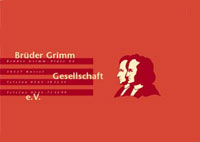
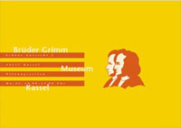
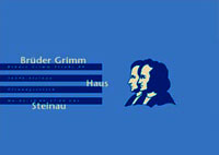
The Logo and Corporate identity for the Society of the Brothers Grimm was one of the key projects during my studies. Its goal was to create a modern, clean image for that society to show that the work of Jacob and Wilhelm Grimm was timeless and always modern. The keyvisual with four bars was meant to stand for books, or literacy in general and could be modified according to different requirements
The CI was used for a few media, but never fully implemented. |